Color Grading on a Budget with Premiere Pro CC 2015 Using Filters, Adjustments Layers and Lumetri Color
Color Grading on a Budget with Premiere Pro CC 2015 Using Filters, Adjustments Layers and Lumetri Color
A Justified Conflict is a low budget short film written by Reuben Williams. It’s shot on Canon C300 with manual prime Nikkor Lenses (28mm, 35mm, 50mm) which helped us achieve a great bokeh effect.
Due to the subject, the film had to take place on the bank opposite the House of Parliament, London. We had no money to ask for filming permits though. Therefore we decided to film late in the evening. The main sequences were shot around 10pm. It had to be a quick and effective setup, I knew we were going to constantly look out for the police. We brought only 3 LED lights with very light stands. The camera was always on a monopod.
I edited and graded the project in the new Adobe Premiere Pro CC 2015.
When the projects have tight deadlines and low money involved, I like to do my grading in Premiere. It saves everyone’s time, especially in shorts like this one where the setups are few.
Here is the color grading breakdwon of two shots.
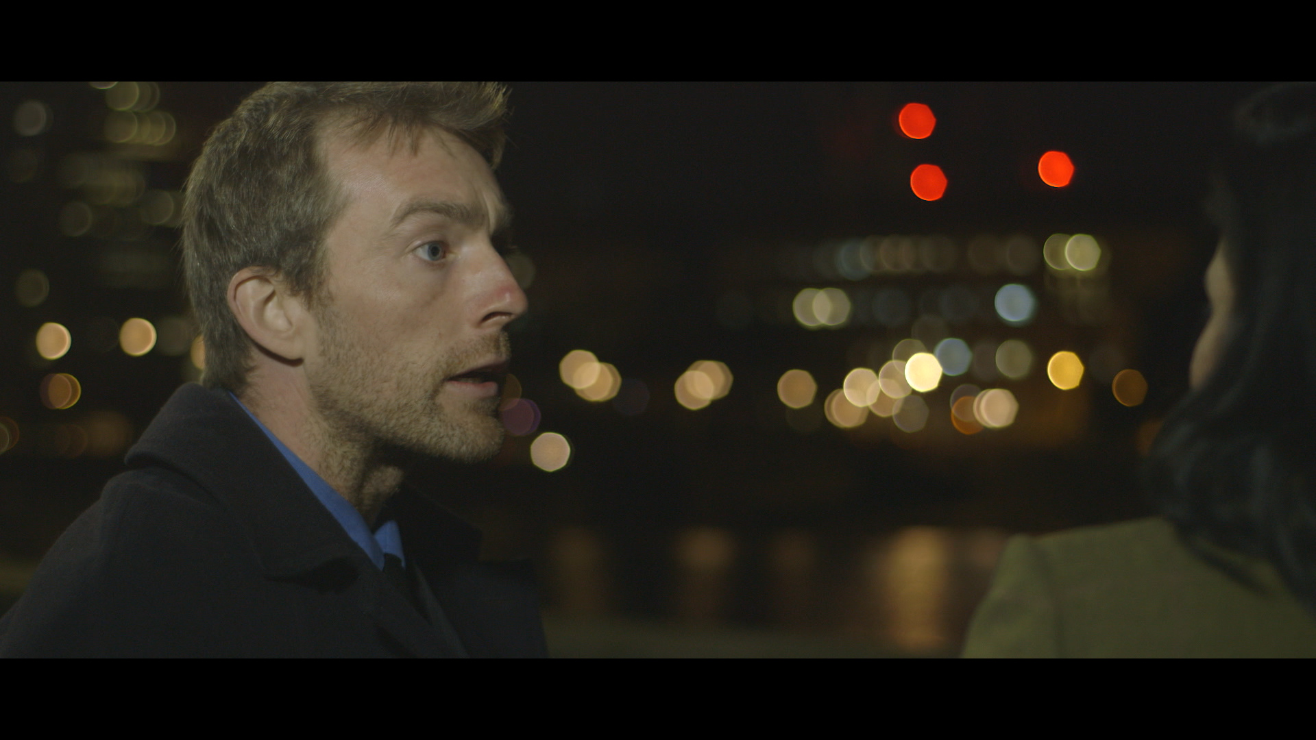
SHOT 1
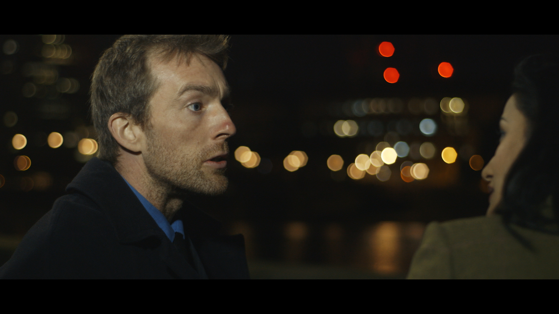
This is our first shot, it has a letterbox of an aspect ratio of 2.28. The shot was well exposed and gave me room to craft a darker and more mysterious look.
STEP 1
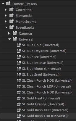
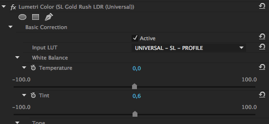
After a few tests I decided to with SL Gold Rush HDR, I used it on an adjustment layer that covered the whole length of the piece. That was going to be the overall look of the short.
I opened the Lumetri Color filter and I slightly pushed the Tint (green-magenta) towards magenta, to reduce -not suppress- the overall greenish tinge.
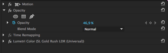
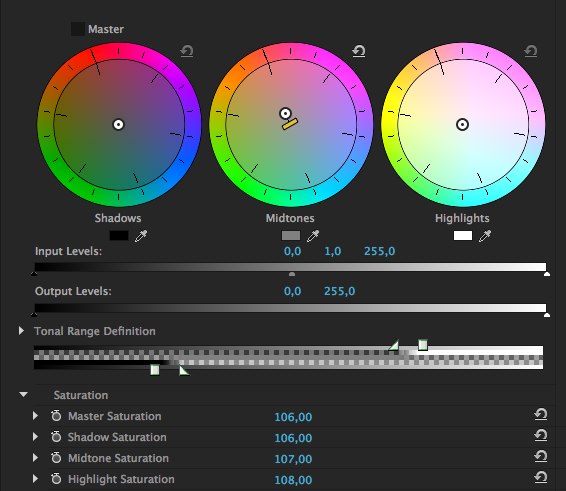
I dropped the opacity of the adjustment layer down to 46,9%. This is the good thing about adjustment layers: you can control the opacity -meaning the strenght- of the filters applied.
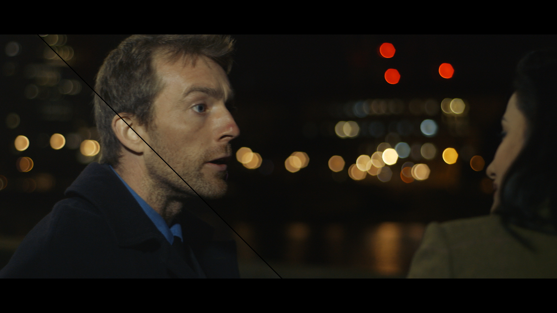
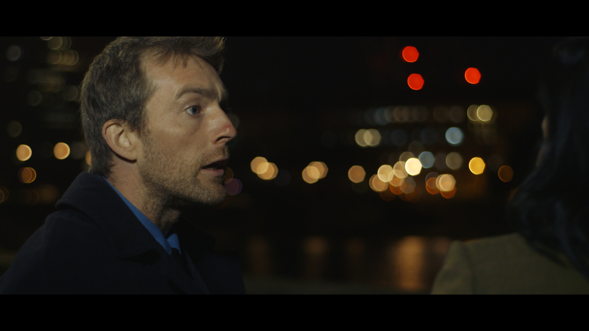
Here is the result, definitely a good starting point. The LUT has darkened the whole image without crushing the blacks, it’s added some contrast and brought out saturation in the warm tones.
STEP 2
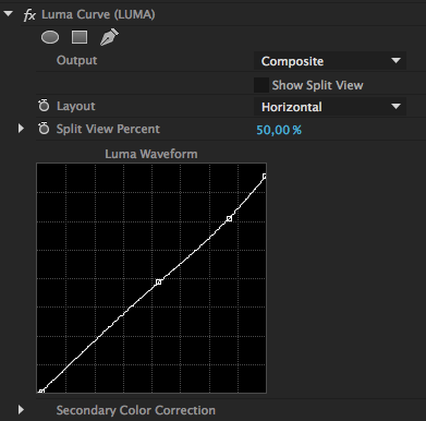
I applied a LUMA CURVE filter to the clip to adjust the contrast and tonality. Always keep your waveform monitor under control. I reduced the highlights and upper midtones, as the shot was too bright. I also crushed the blacks just a bit.
STEP 3
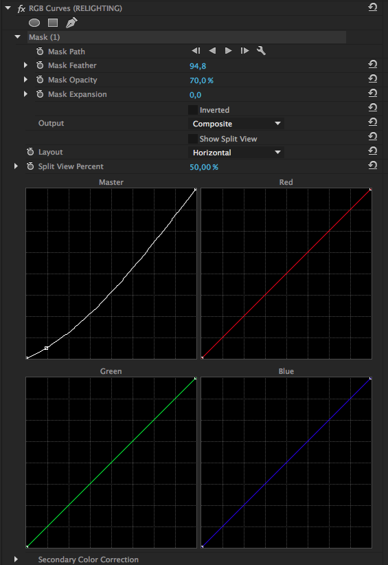
I added a RGB Curves filter to the adjustment layer to apply an undertone to the image (a color cast applied specifically to a thin sliver of image tonality).
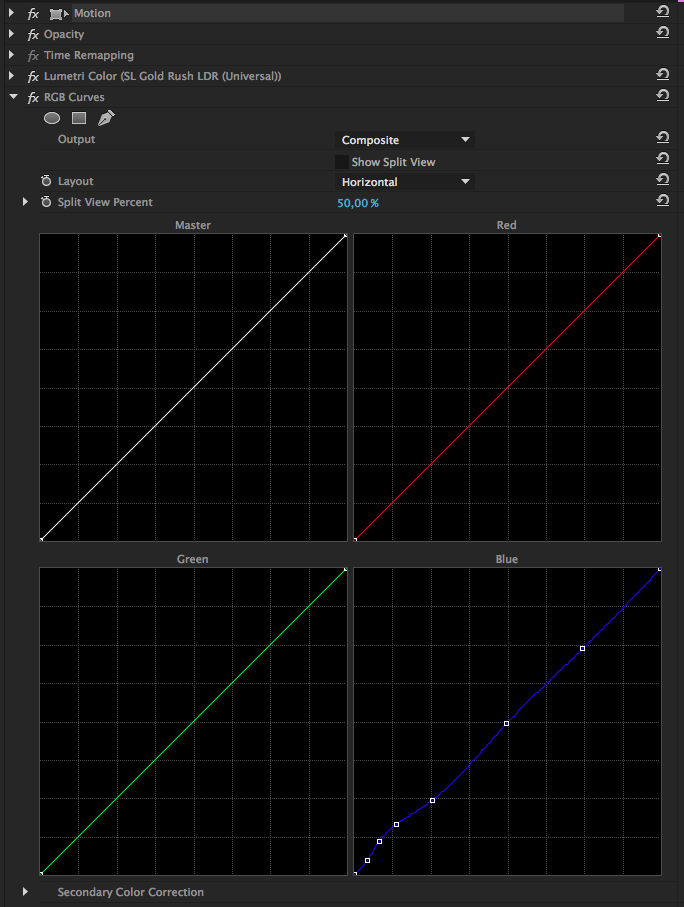
It is usually applied to the upper shadows of an image, in this case I applied it closer to the bottom, paying close attention to leave the darkest portion untouched. Do not apply undertones to the darkest blacks, you will not achieve the same vibrancy and you’ll end up with an Instagram look that looks unprofessional. Do not use Three-Way Color Corrector to achieve the same look, unless you create a secondary color correction selecting only the upper shadows with the Luma qualifier.
STEP 4
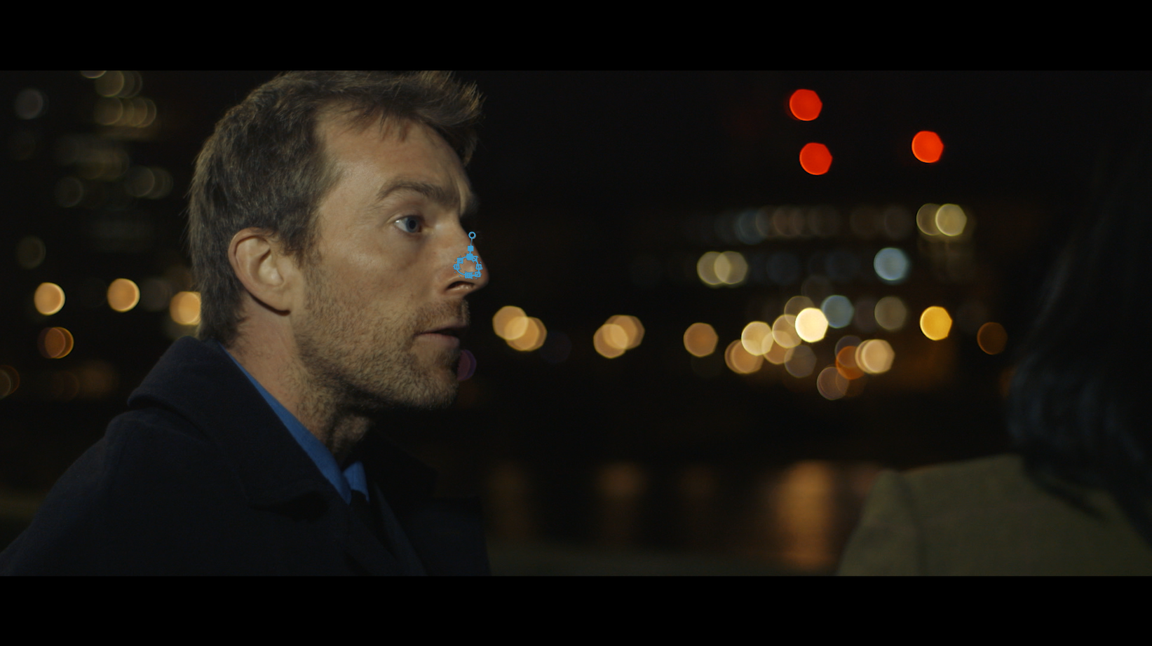
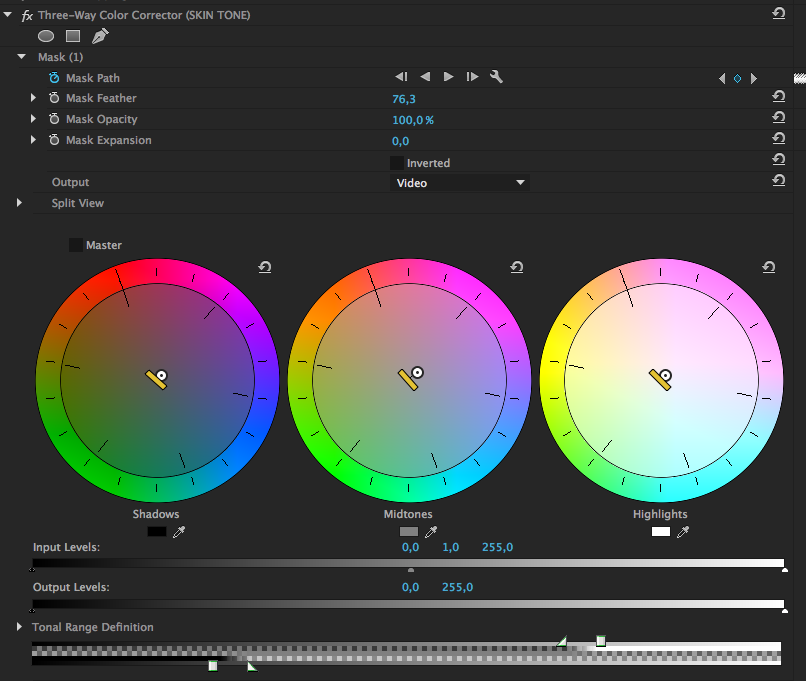
Grading is about making your actors look good as well as helping the story progress. The pimple on the actor’s nose distracts the viewer and draws attention away from the story. So I had to do something. I applied a Three-Way Color Corrector to the clip, the goal was to reduce the redness, decrease saturation and make that small amount of skin look natural.
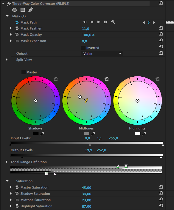
Below you can see the mask applied directly within the filter, limiting the adjustment to that portion of the image. I used the mask tracking feature to track the mask to the pimple, not an easy task, I often had to tweak it manually.
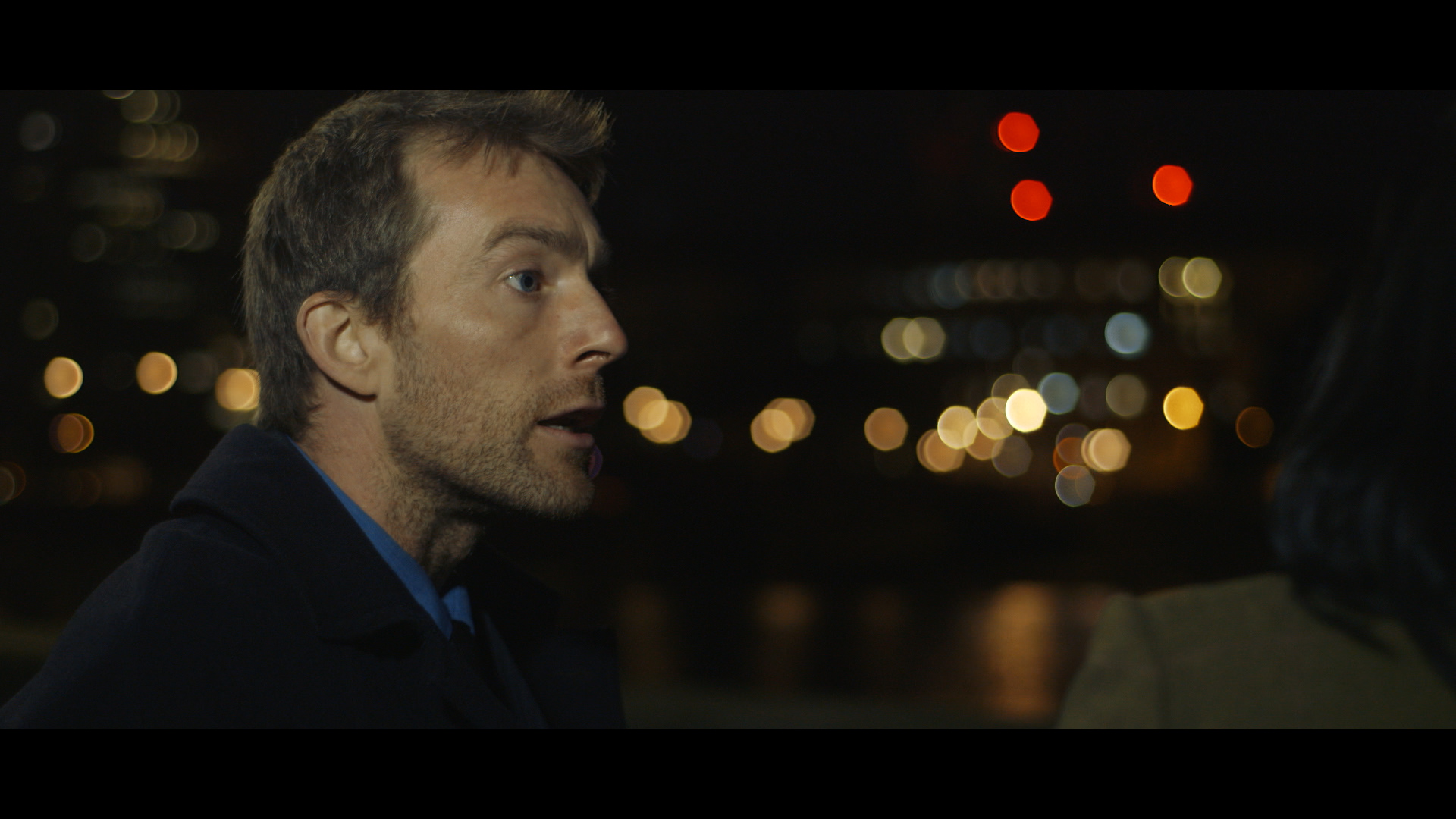
Here is the shot with the effect applied:
STEP 5
As I said, the shoot had been done guerrilla style, on a very low budget -most of it gone towards the camera rental. We didn’t have any filming permits: it had to be quick and discrete.
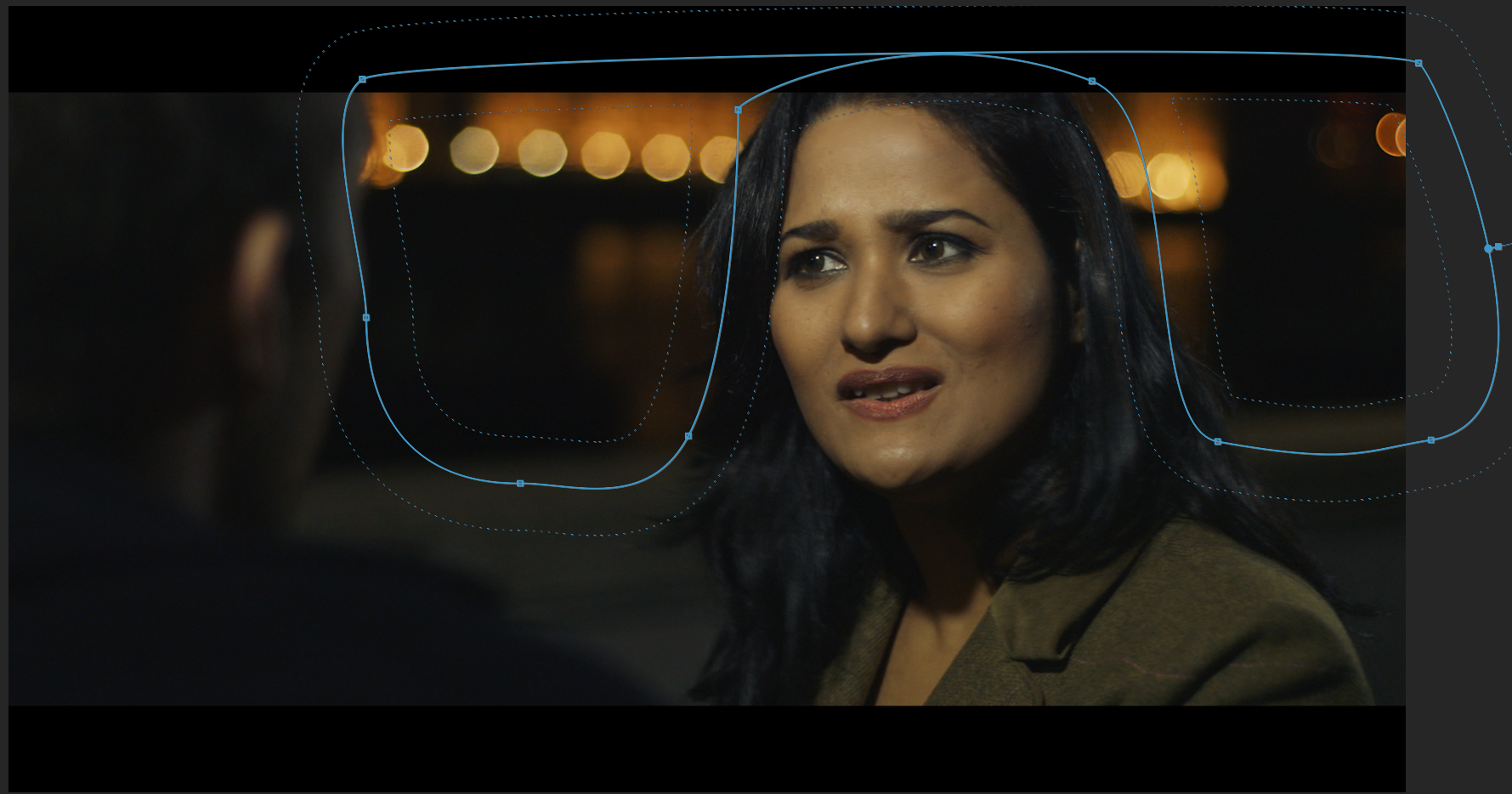
We only had cheap LED lights without barn doors, we couldn’t shape the light on the set. I decided to relight the shots in post to create more depth.
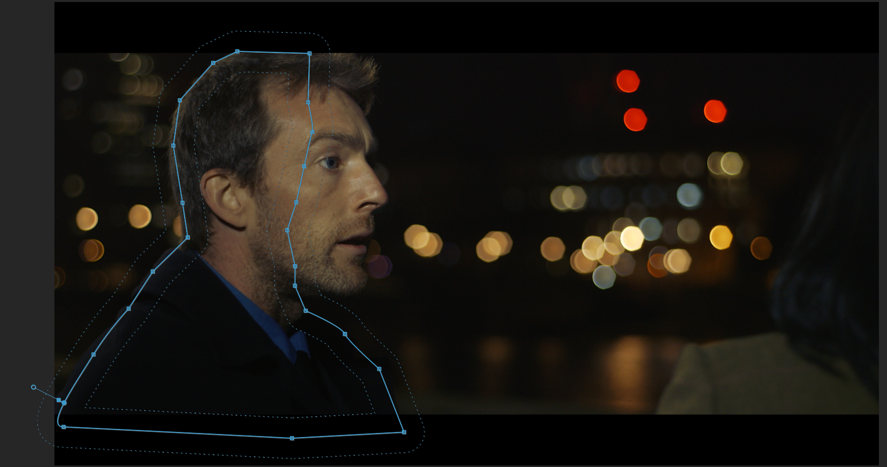
I drew a mask on the right side of the actor, well feathered and with opacity down at 70%. It created that sense of depth that was missing due to the flat lighting. I tracked it to the actor where needed, it’s fairly seamless.
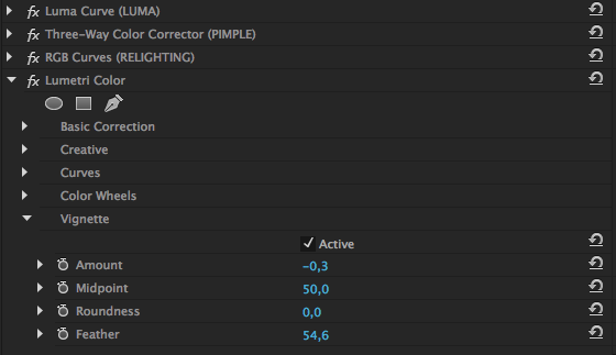
STEP 6
I finally added a vignette using the extremely useful new Lumetri Color filter.
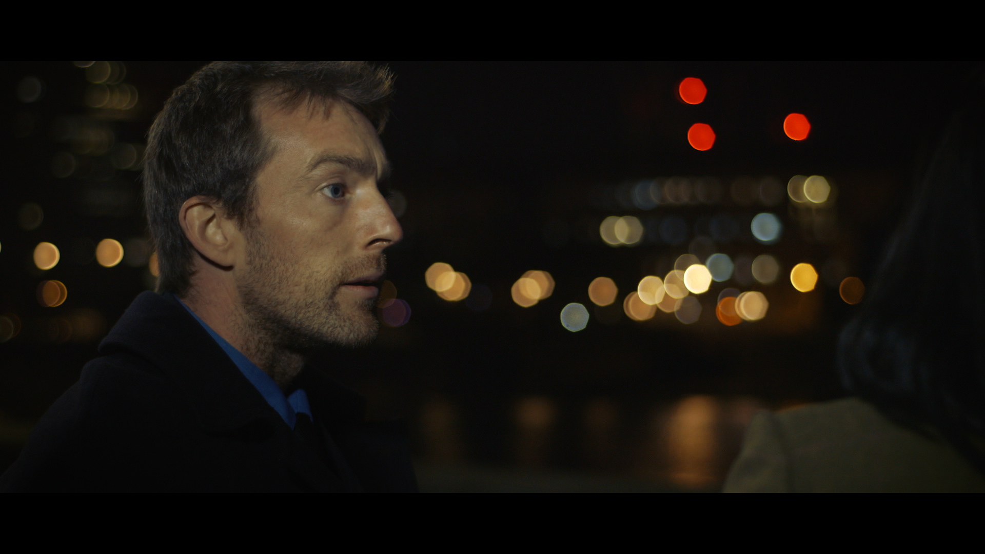
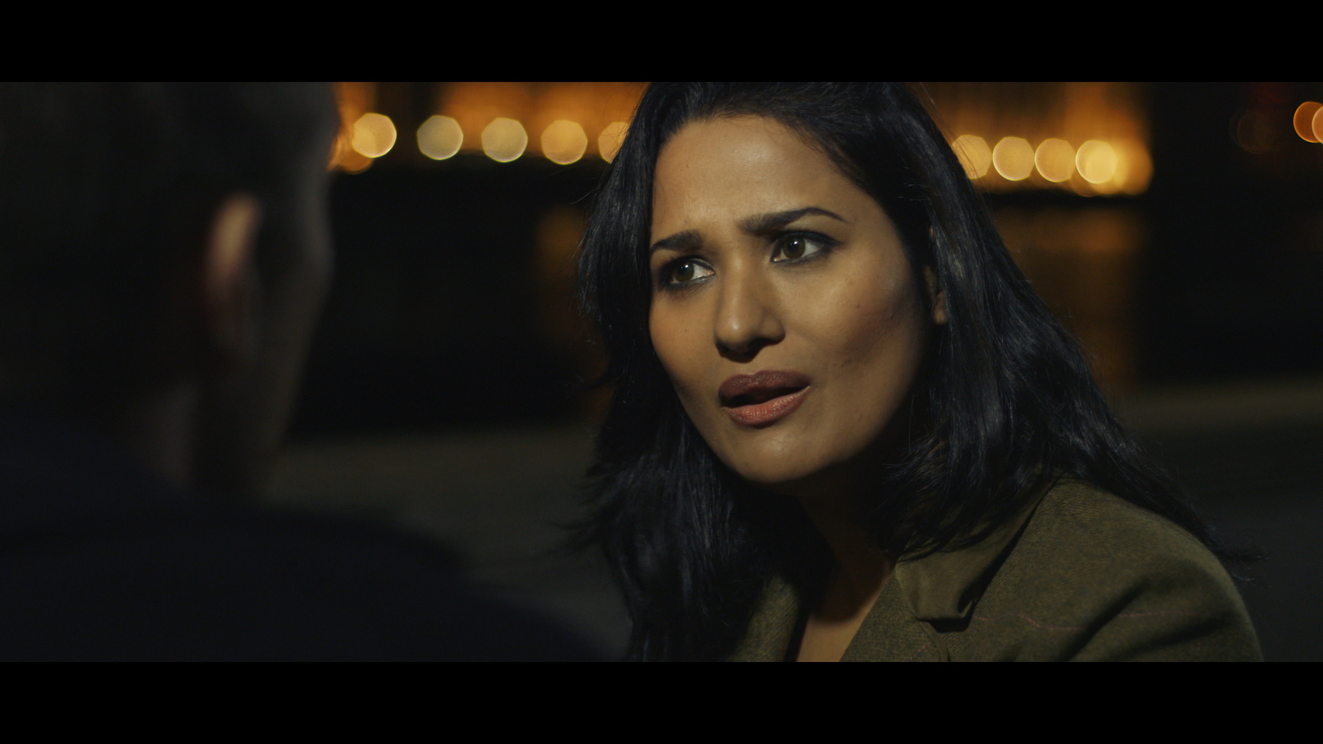
Here is the final shot:
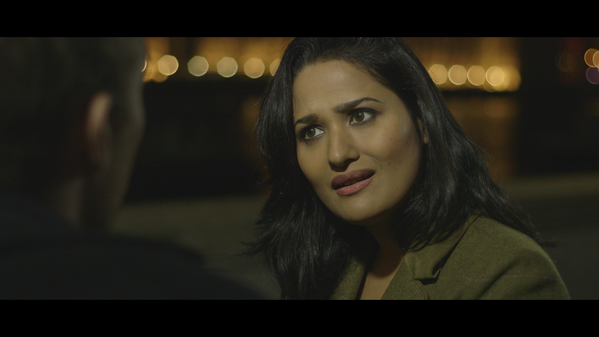
SHOT 2
Here is our second shot, straight from the camera:
STEP 1
Step 1 is the same as the previous shot, the adjustment layer with the LUT runs across the whole piece.
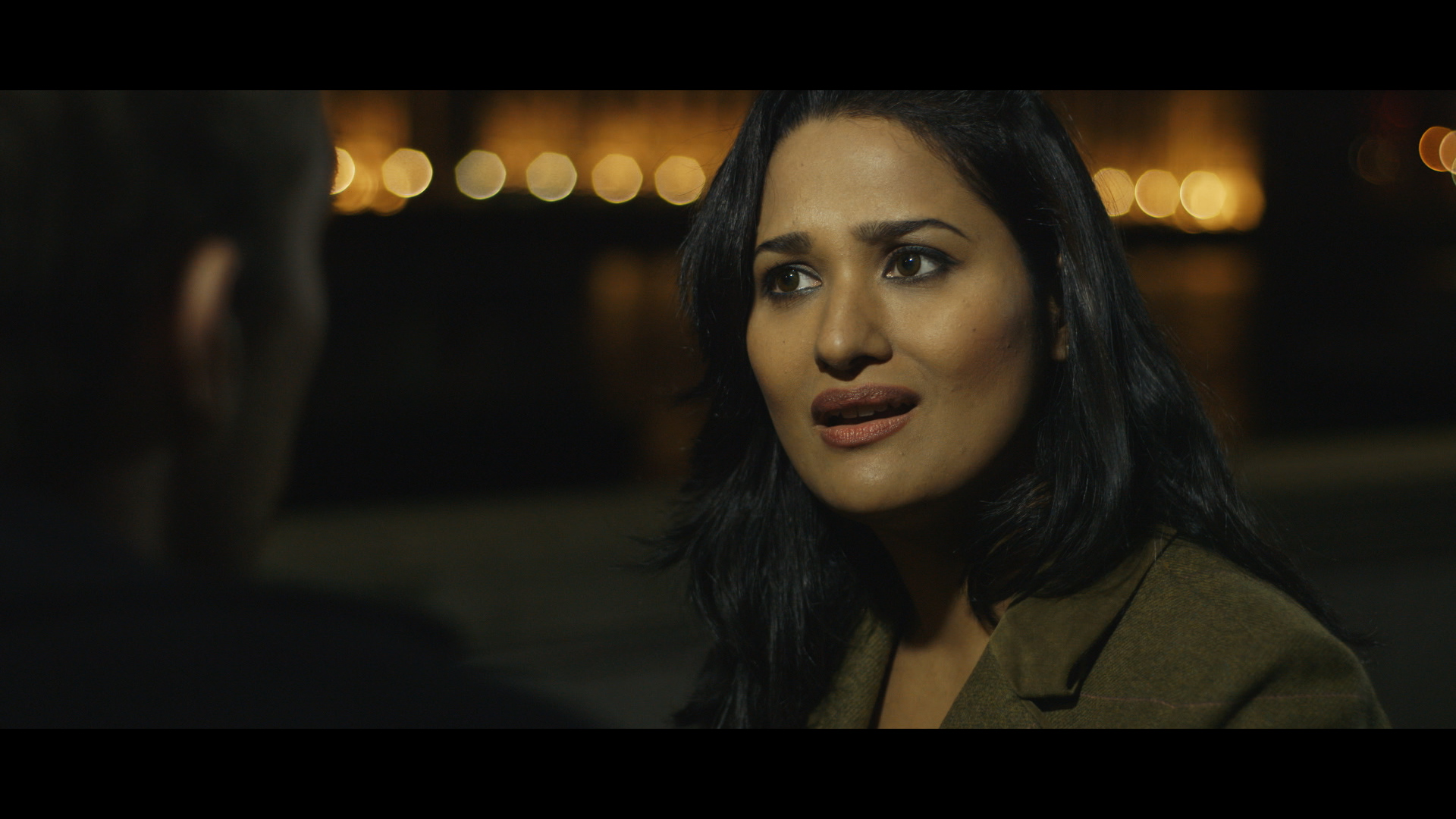
It resulted in a contrasty and vibrant image. Again, this is a good starting point.
STEP 2
The adjustment layer contained the same undertone as the other shot.
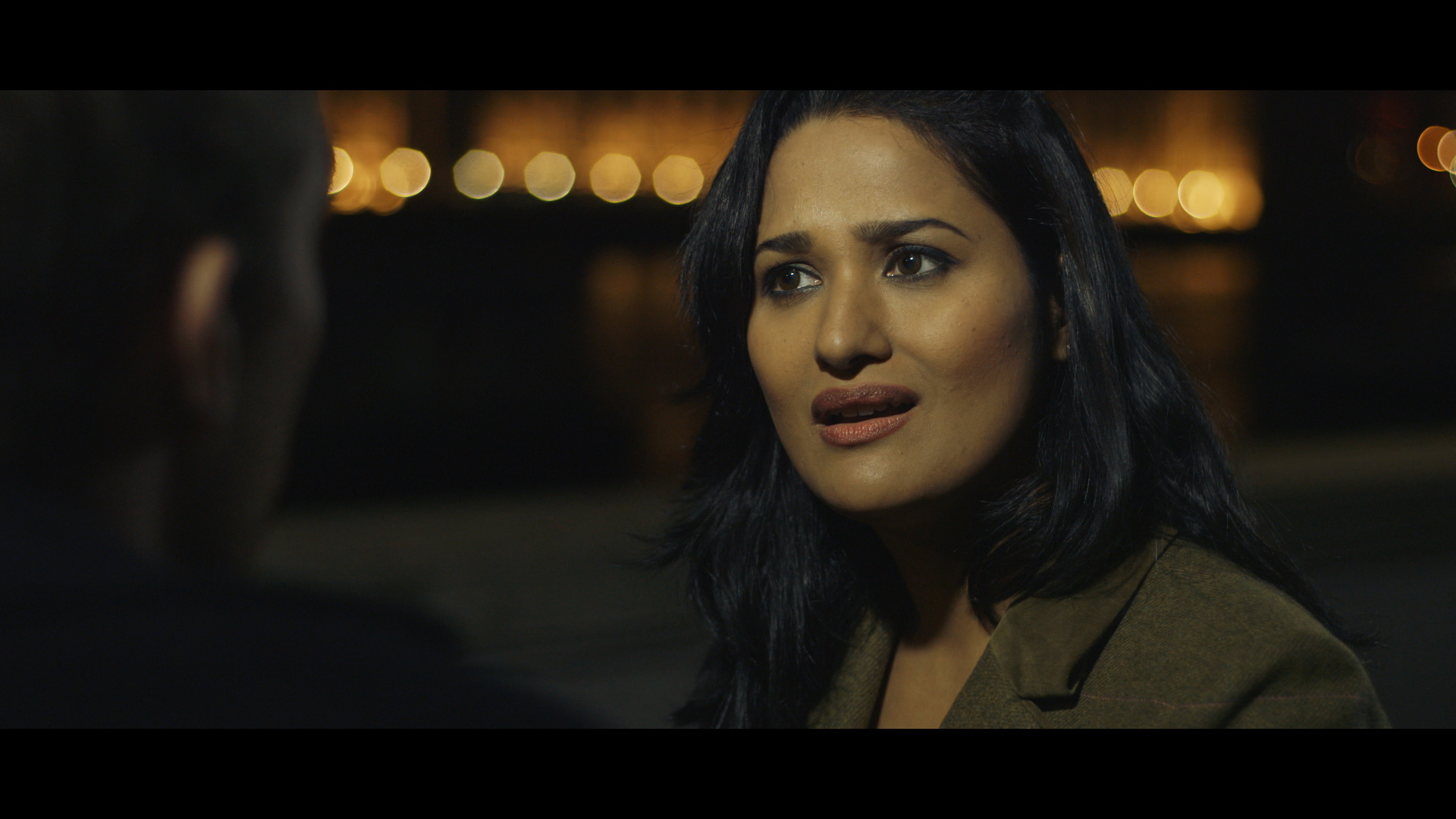
As you can notice it’s very close to the popular teal and orange Hollywood look.
STEP 3
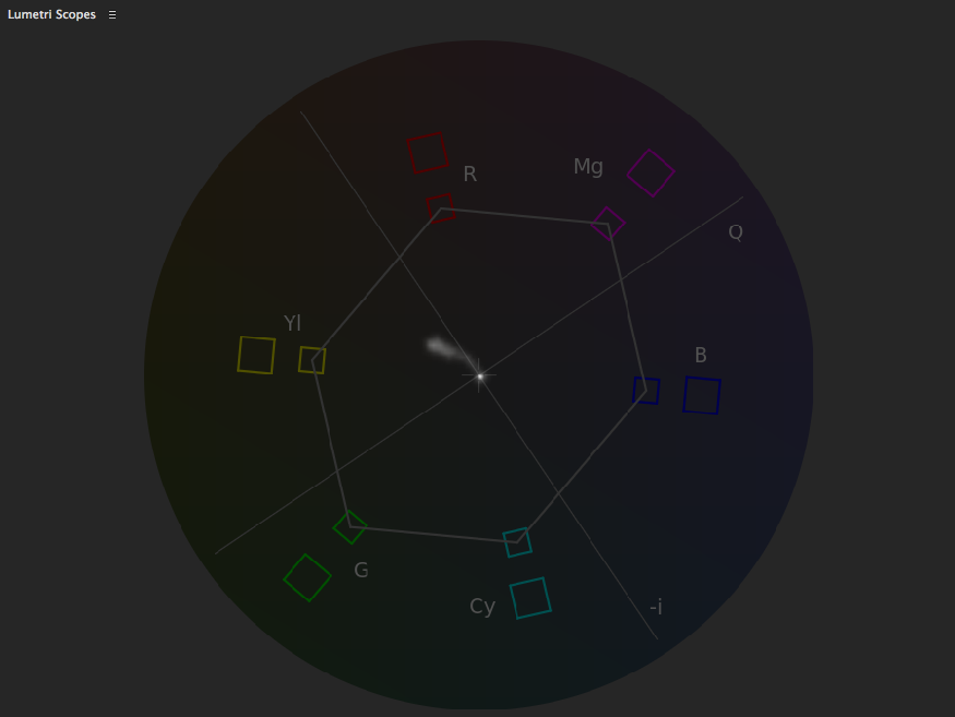
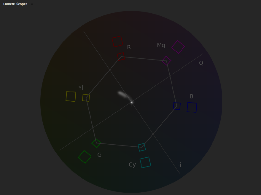
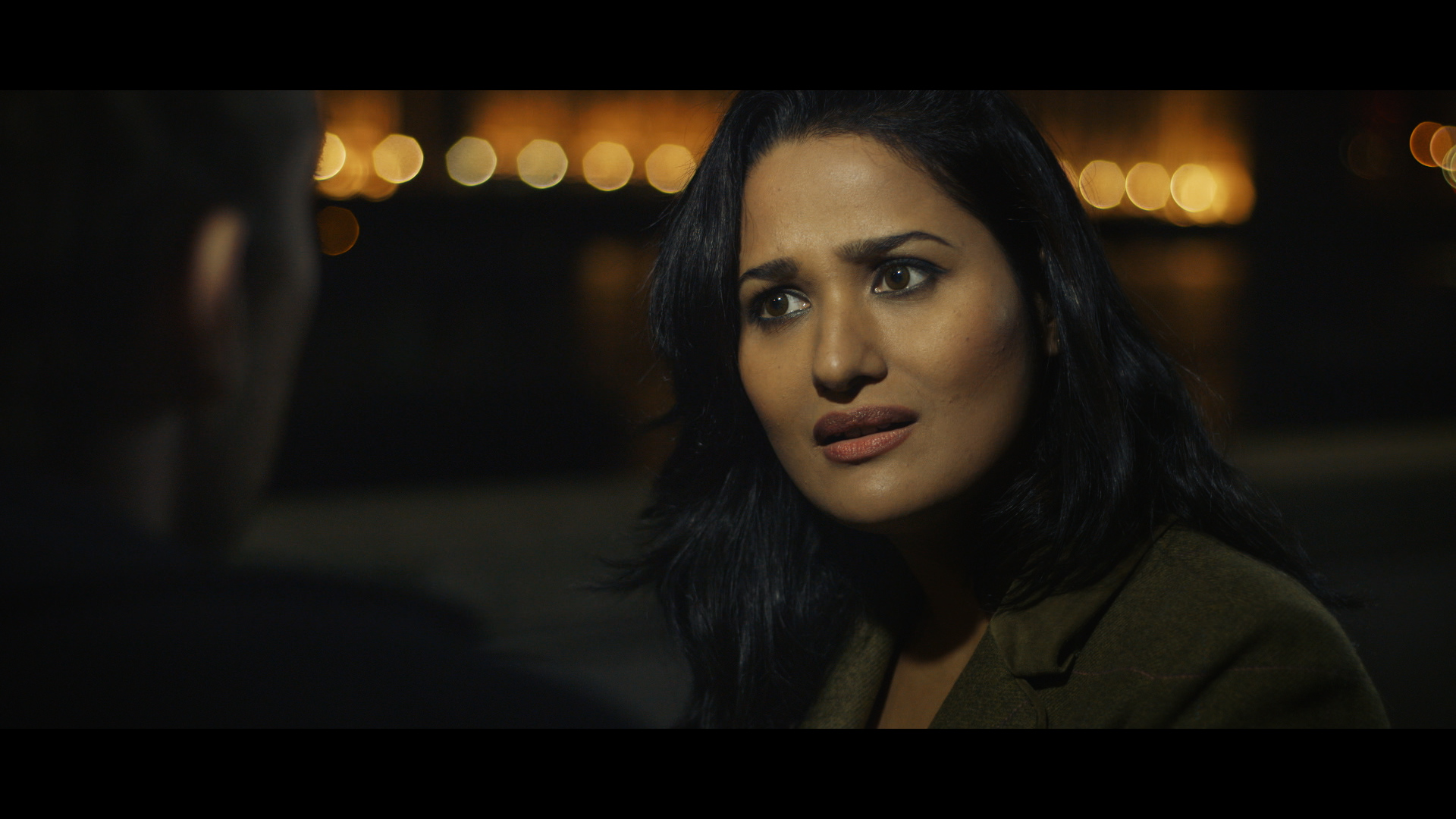
The actress complexion needed some tweaking. I cropped a portion of her skin to evaluate where her complexion fell in the Vectorscope.

Here is a screen shot the Vectorscope in new Lumetri Scopes. It skewed a bit too far towards yellow/green
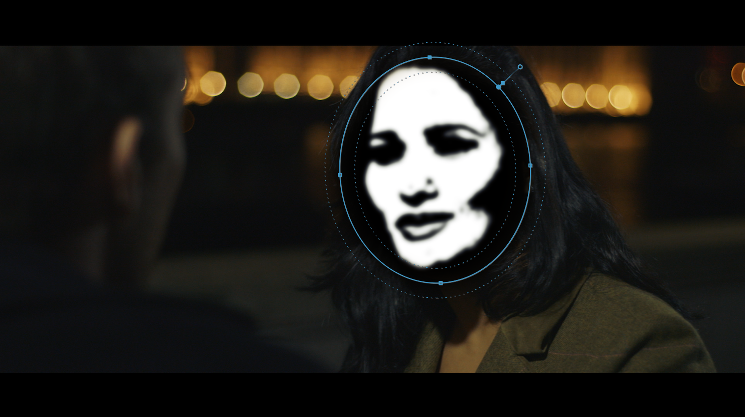
I applied a Three-Way Color Corrector and enabled the Secondary Correction. I pulled the key using Hue, Saturation and Luma controls, then I softened the key.
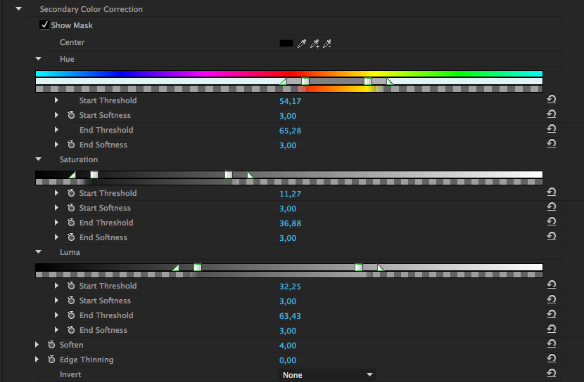
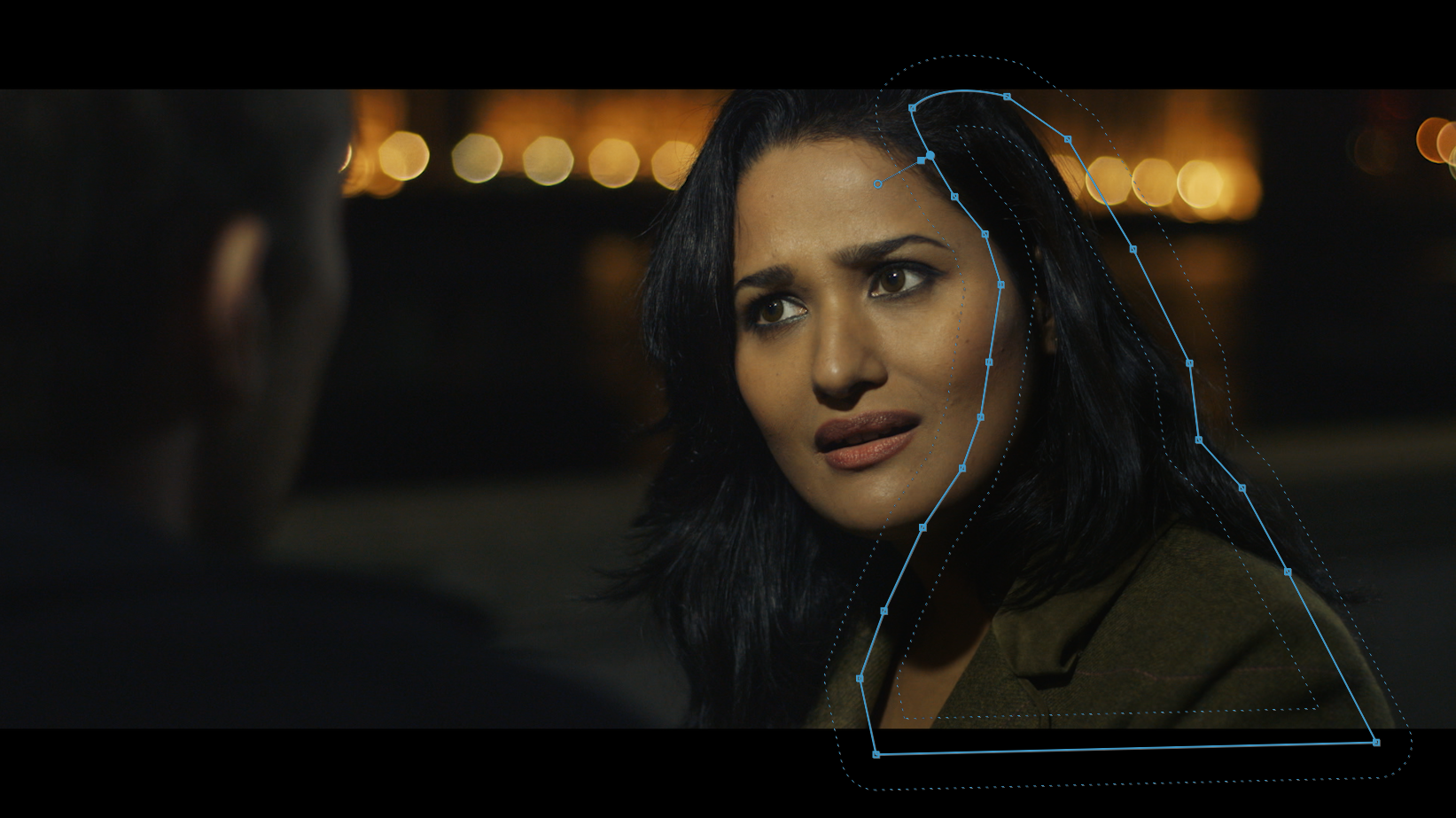
I also limited the effect to the actress’ face by applying a mask around it.
I used the wheels to make the correction. I pushed the three wheels towards red/magenta.
Let’s check again the Vectorscope:
Remember in color grading a small change goes a long way. The actress is from India, her natural complexion has more yellow tones compared to a Caucasian person’s.
Here is how the corrected shot looks:
STEP 4
Next thing was bringing out those warm tones in the background, the House of Parliament, which plays a significant yet silent role in the film.
I pushed the mids towards orange/red and increased the overall saturation. Then I found that the quickest way to limit the effect to the background was to draw a mask. Again a small correction goes a long way. You don’t want the background to overpower the actors. As a colourist you should always serve the story.
The mask didn’t need to be super precise to achieve the desired effect. I feathered by a fair amount so that the effect wasn’t obvious.
STEP 5
Like the previous shot, I found that it lacked depth, so I used the same RGB Curves filter and draw a mask on the right side of the actress.
Just like the previous shot, the mask is well feathered and with opacity down at 70%.
STEP 6
I finished it off wit the same vignette as the previous shot, using the new Lumetri Color filter.
Here is a short video of the grading breakdown:
CONCLUSION
I found that the new Adobe Premiere Pro CC 2015 offers a variety of tools that really help you go through your grading session much faster and much more efficiently than never before. Especially in instances like this where the budget is limited and you don’t have the time to send your project to Da Vinci Resolve or even Speedgrade.
This article is mentioned in an extensive color grading post on jonnyelwyn.co.uk.
11 Comments
Raaj Kumarc
November 17, 2021What a amazing blog post and article
Hana Lannister
December 12, 2021Thank you for sharing your amazing post.
Raaj Kumar
December 19, 2021Keep on sharing and writing such a good post
Shah
December 19, 2021Its a amazing and tremendous blog post
Babar
December 19, 2021So nice and knowledgeable post
Rahul
December 20, 2021premier pro cc is my best version so far..I really love this software for all my editing work.. Thanks for the wonderful tutorial.
James Knights @zimma_official on Instagram
January 11, 2022Amazing stuff thanks for taking the time to create such content!
James Knights (@zimma_official)
January 12, 2022Really enjoyed reading through this content, thanks a lot for sharing!
Best Poetry Wala
April 22, 2022Very nice and interesting article. Thanks for sharing this amazing article
Sports View
August 16, 2022Thnak you for share
Rizwan Ahmad
August 20, 2022thanks for this informative content